Project Overview
PROBLEM
In the midst of a global pandemic, the difficulty to connect with peers is impacting the mental health of college students. Losing pieces of independence, missing social events, struggling to make new friends, diminishing communication with classmates, and even having to move back home with their parents, all with little time to adjust has left college students to suffer in what was supposed to be "the best 4 years."
SOLUTION
Give college students the opportunity to make new and meaningful relationships with their peers online. While Zoom and other video hosting platforms are effectively being used in classrooms and meetings, people don't necessarily associate them with fun and socializing. Kickback takes away the intimidating stares, stressful lectures, and professionalism, and invites users to relax and have fun. So how do we replicate in-person events, virtually?
Design Process
01 EMPATHIZE
User Interviews
Being college students ourselves, my team and I knew exactly how it felt to not be with our peers in the classroom. We decided to conduct three individual interviews with those who could give us more insight into the variety of experiences students were facing: a freshman who is experiencing college for the first time, a senior who has experienced in-person classes up until this point, and a professor who has experienced the university as a whole for years.
OVERVIEW:
• Method: Remote, moderated zoom interviews
• Participants: 3
• Age Range: 19-45
• Currently attending a university that recently went online
LEADING QUESTIONS:
1. How do you keep in touch with people? How has COVID affected this?
2. How did you meet new friends before COVID?
3. Have you met any new people in the past 6 months? If so, how?
4. How would you describe your emotional health after zoom?
5. Have you recently used video to communicate with people for a non-school purpose?
"Overall it's been harder making new friends online"
Freshman College Student, Interview
User Personas
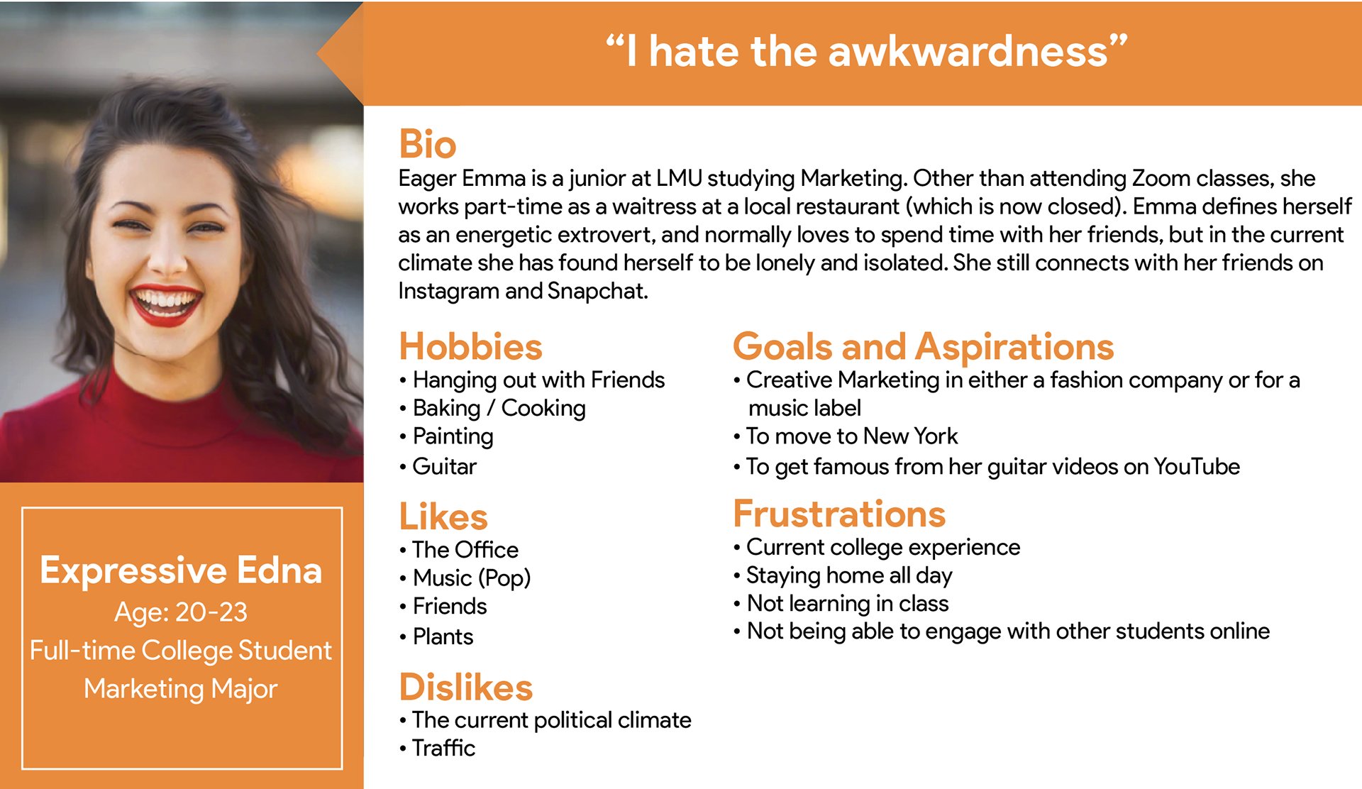
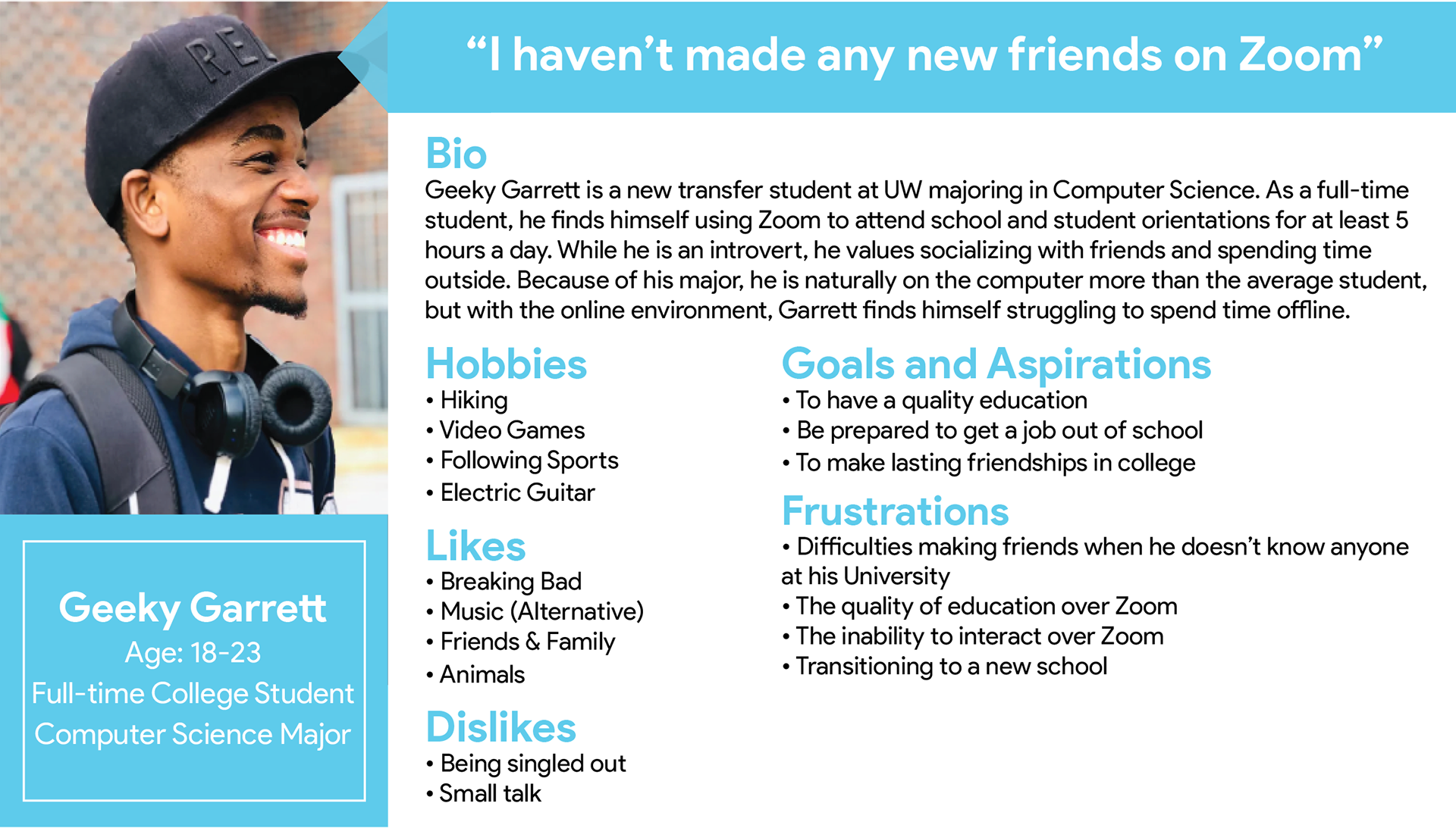
We aimed our focus on the students whose needs revolved around forming new connections. In our research, we found transfer students were given very few onboarding opportunities by the university program compared to the freshman despite also being in a brand new environment. This motivated us to focus on the users who were craving new social outlets.
User Journey
Task: Finding an event. We created a user journey map for our transfer student, Geeky Garrett, as he navigates through the app in search of an event that is interesting to him and can help him find a community.
02 DEFINE
Insight
Meaningful engagement with technology boosted energy. At the beginning of our research, we had predicted that screens and boring lectures were the main causes of this emotional drain. Getting students connected wouldn't work by encouraging lower screen-time, but rather encouraging mindful and purposeful use of technology to meaningfully engage with each other.
"Shared spaces and experiences is how I make friends"
Senior College Student, Interview
Sitemap
Deciding to focus on the community aspect, rather than individualized friendships, we created the information architecture to organize the main three features: browse events, create events, and the user's profile.
03 IDEATE
Storyboard
Being the new kid is hard enough, then throw in a pandemic. We used a storyboard to showcase Garrett's use of the app. Being that he is active on social media, we wanted to highlight that as a touchpoint for discovering our app.
Sketches
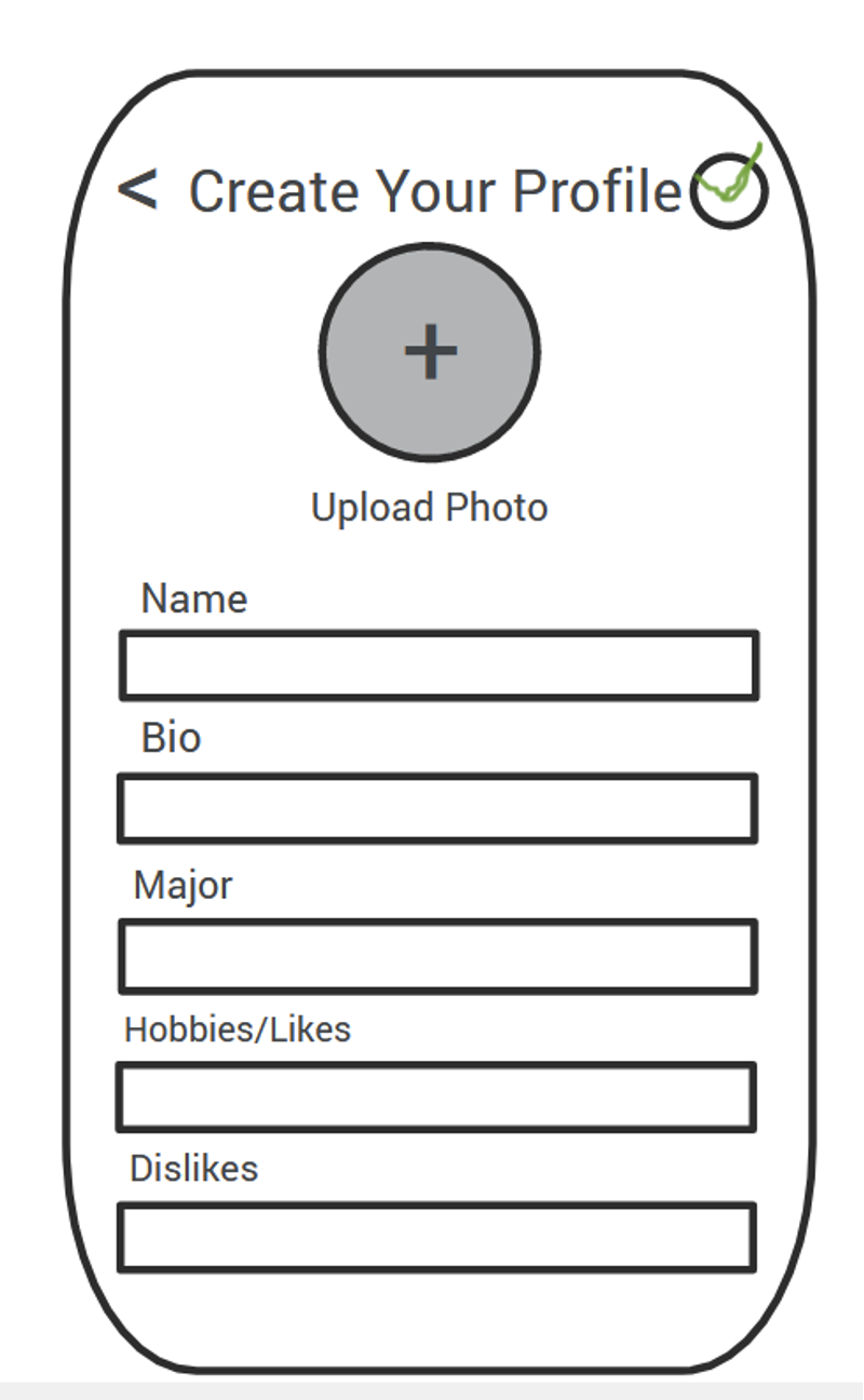
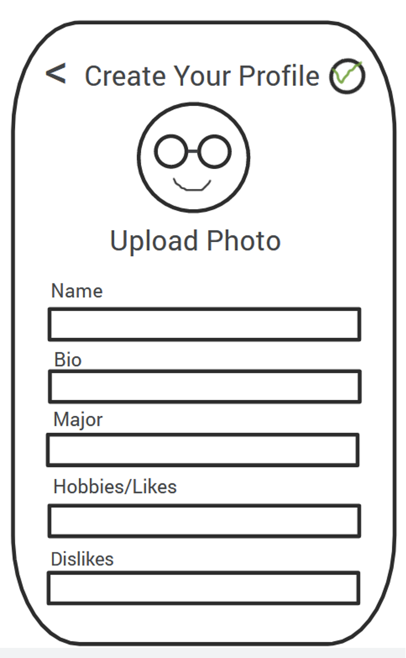
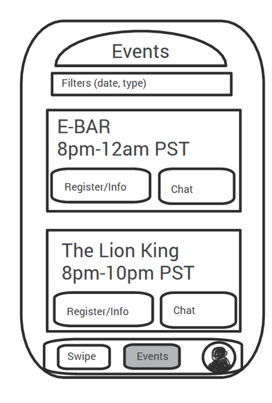
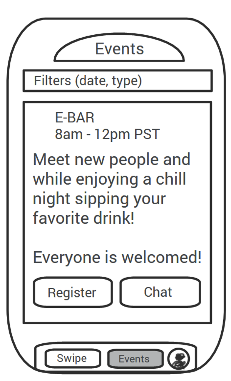
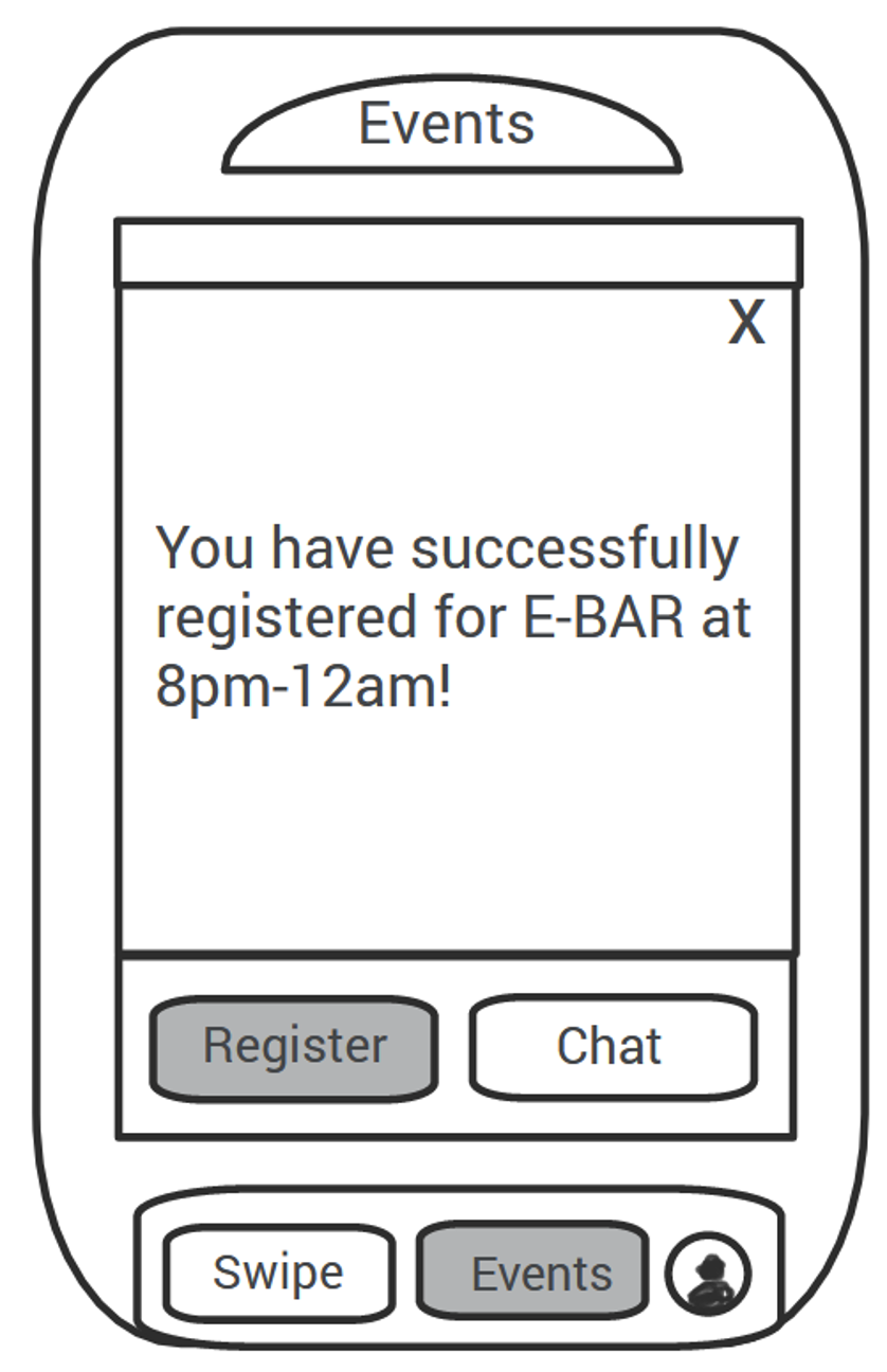
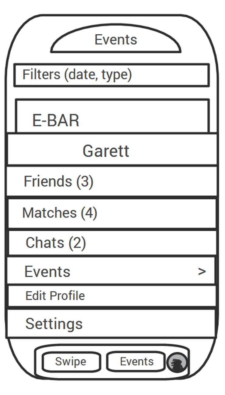
Using everything we define throughout this phase of the design process, we sketched out some wireframes to begin the testing and work through which features would be most valuable for our users.


04 PROTOTYPE & TEST
Usability Testing
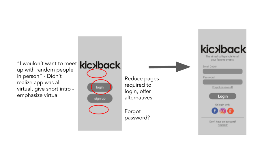
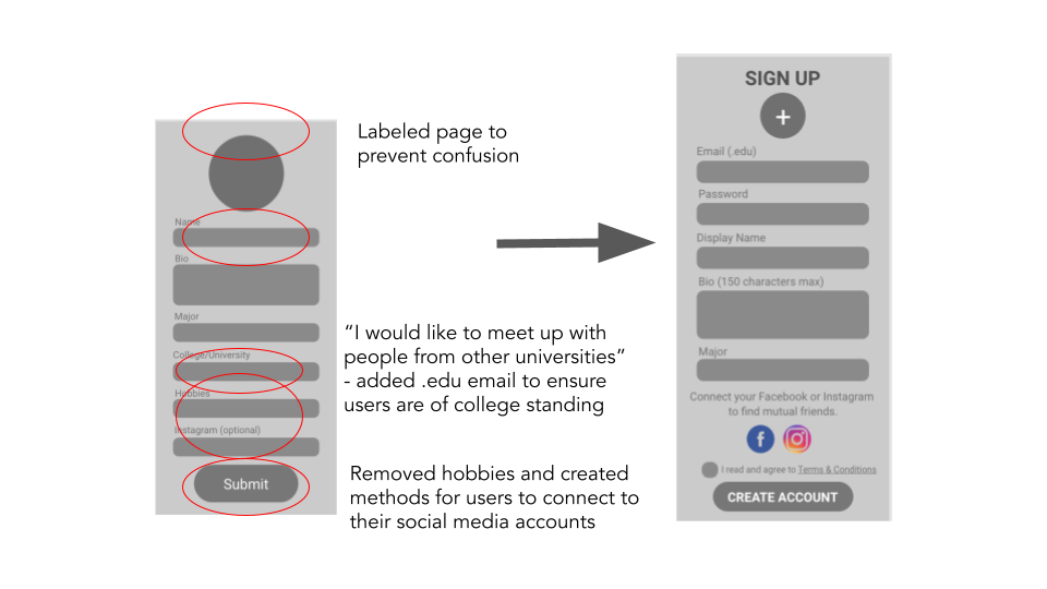
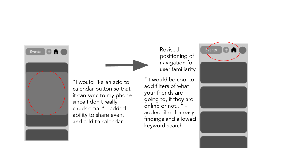
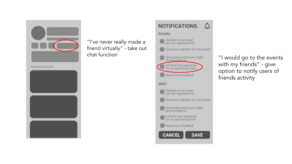
We used Adobe XD to create a mid-fi prototype which we used to test with remote participants. We came up with design solutions based on two separate rounds of user testing. Initial features such as a chat function were removed in the updated wireframes.
OVERVIEW:
• Method: Remote, moderated zoom interviews
• Participants: 2
• Age Range: 18-24
LEADING QUESTIONS:
1. Show us how you would create an event in the app. What kind of information do you imagine the app would ask for?
2. What categories would you imagine the events to be in?
3. Would you use this app with your current friends?
4. What information would you be comfortable sharing in your profile?
5. Would you use this app to meet new people? Why or why not?
Style Tile
We wanted to create a space that separates students from school. So, using inspiration from pop culture icons such as Tyler the Creator, we decided on bright colors and sans serif typefaces to add a modern, fun, and exciting feel to the platform.
Hi-Fi Wireframes
After defining our style tile, we were able to apply the UI design of the app and put it all together!
Interactive Prototype
TAKEAWAYS
Diving Headfirst
Being that this was my very first project going through the entire UX process, I found that my background and education in advertising and graphic design were very helpful to understanding the basics of user stories, research, and concept. Of course, things such as usability studies, wireframing, prototyping, and using Adobe XD were all completely new to me. I'm thankful I was able to work with such a great, dedicated team that put the work in. I was very impressed with our ability to complete three separate usability studies throughout the process, with little prior experience in research and interviews. Being able to do this semester's study at LMU gave me the resources and direction to make mistakes and grow, for which I cannot be more grateful.
If time was not of the essence...
That being said, an intro to UX project with four newbies will not be perfect. Some opportunities I would have loved to take if there had been more time are exploring more in-app features that could address more of our user's pain points, such as connecting with friends to bring a level of comfort in the platform or personalizing the profile pages more to what kind of content they are interested in. I also had no idea how much work it would take to keep track of each button, page, and action, which in turn led to fewer actions possible in the prototype, and probably a bunch of missing screens! Of course, there are other things that can be improved, but overall this was a great learning experience and I am excited to continue the learning journey.

