Project Overview
PROBLEM
51% of restaurant operators say staffing is the top challenge to success, simultaneously, turnover in the service industry is at an all-time high at 75%. Employees who work in industries that don't offer consistent schedules can find it hard to plan in advance. Service industry jobs often fail to provide their employees with a sufficient work/life balance that works for them.
SOLUTION
Quick Shift will let users better communicate their availability which will affect employees with inconsistent schedules by allowing them to easily find covers or pick up shifts. We will measure effectiveness by user feedback reports and annual company turnover rates.
Design Process
01 EMPATHIZE
User Interviews
OVERVIEW:
• Method: Remote, moderated one-on-one interviews
• Participants: 6
• Age Range: 18-30
• All fit criteria for retail/food industry experience
LEADING QUESTIONS:
1. What was the most challenging part of your job?
2. How was your communication with your boss? Fellow employees?
3. How did you typically get your work schedule?
4. Did you have the option to pick up extra shifts? What was that process like?
5. If you needed to miss a day of work for a non-emergency, how would you go about telling your manager?
6. Is there anything that could have improved your scheduling experience?
I created an empathy map that highlighted the main insights I gathered from the interviews. It seemed a lot of the pain points revolved around the inconsistency with shift scheduling, as well as the treatment they received from their work when it came to any form of time off. I was then able to form my hypothesis: if employees were able to have more control in their scheduling would they be more productive?
User Personas
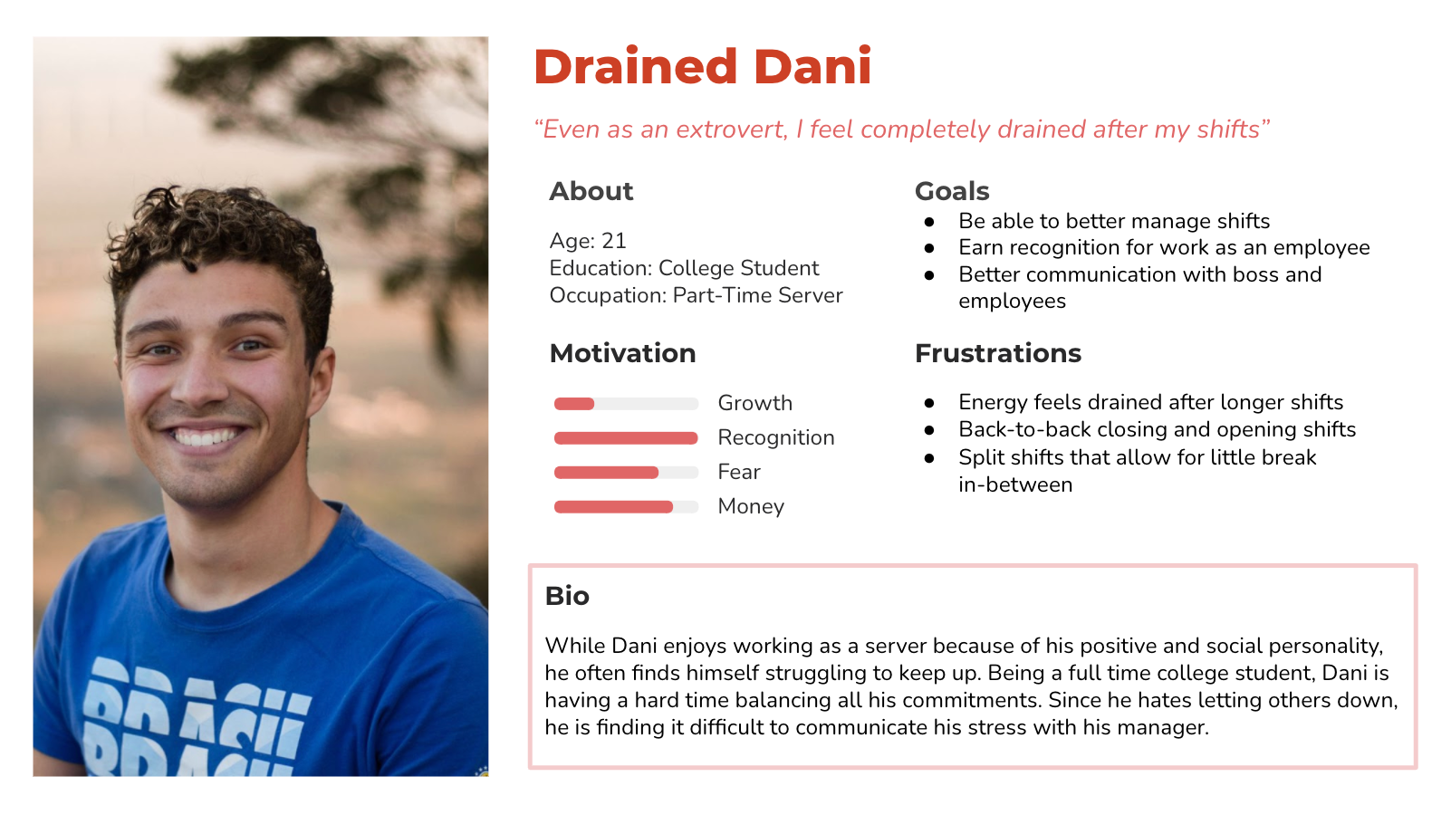
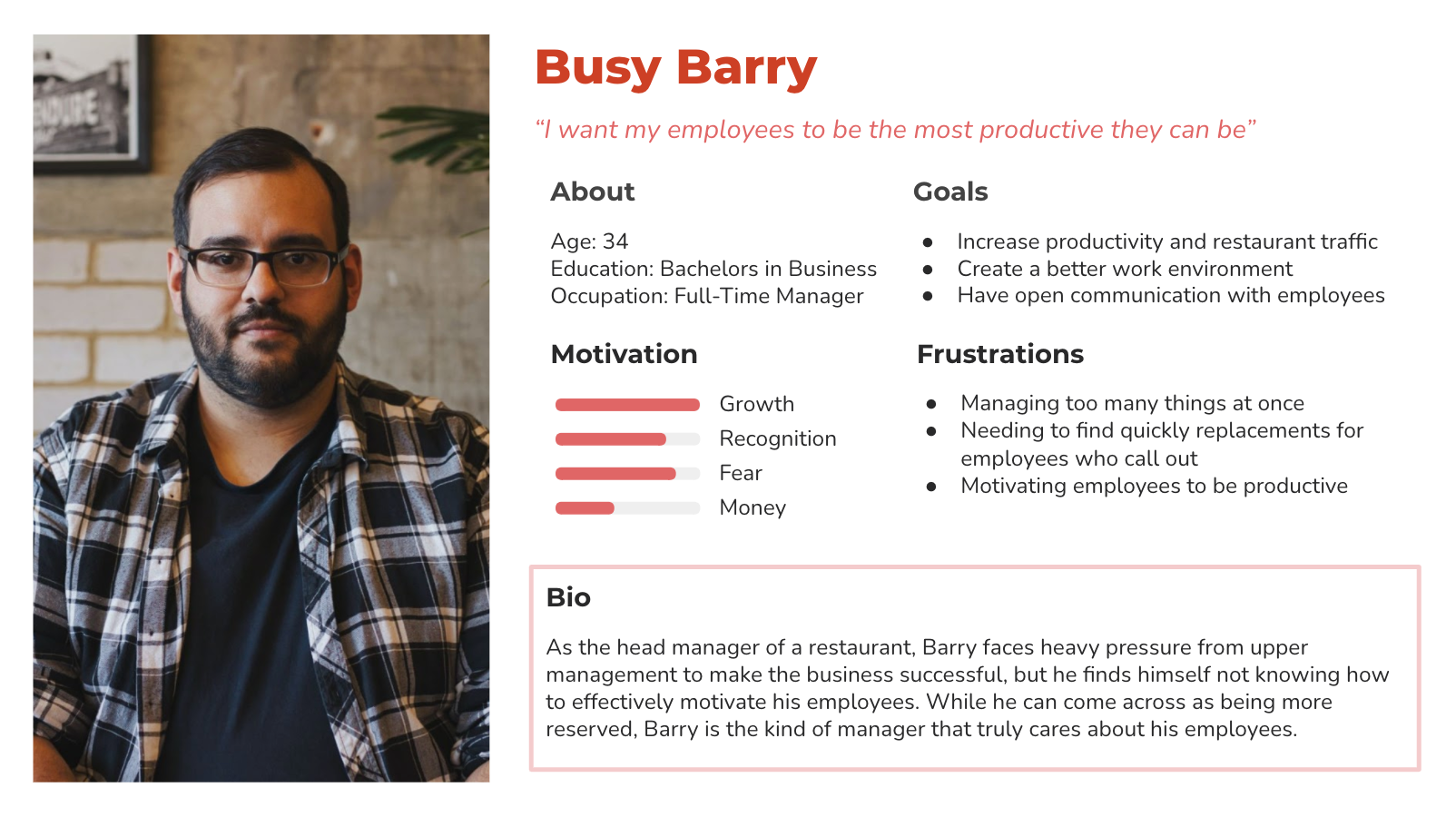
Over 40% of service industry workers are under 24, who are working part-time alongside school or other career programs. Since these young employees typically had less consistent schedules than their older co-workers, I chose to focus on Malia, Dani, and Barry, who are all looking to take more control over their schedules.

02 DEFINE
User Flow
I wanted to gain a better understanding of the overall journey that Malia or Dani would be taking throughout the app whether it be picking up a new shift or finding a cover. I wanted to better empathize with the different decisions they would be making and make the flow as simple (and short) as possible.
Sitemap
Once I had the user flow I could get a better understanding of what the layout of the app might start to look like. Because the users found communication to be a barrier when organizing their shifts, I decided to add a messages feature where they would be able to safely communicate with their fellow employees.
03 IDEATION
Sketches
Using my research and insights, as well as considering the goals of the user, I sketched out paper wireframes of the app starting from a login screen to updating availability.
Digital Wireframes
Now that I had some rough sketches I was satisfied with, I turned them into digital frames that would soon become a mid-fi prototype for usability testing.
05 PROTOTYPE & TEST
Usability Testing
Now that I had the prototype, it was time to start some testing. I conducted moderated individual interviews for testing the key user flows. I asked the users to think aloud while navigating around the app, and made sure to ask follow-up questions whenever I noticed a hesitation in interaction.
OVERVIEW:
• Method: Remote, moderated usability testing
• Participants: 4
• Age Range: 20-40
LEADING QUESTIONS:
1. Are there any parts in the process where users get stuck?
2. How long does it take for users to request a shift from the home menu?
3. What can we learn from what information the users look for in shifts?
4. What can we learn from where the users go to change their schedule?
5. Where does the user go to pick up a shift or request a cover?
Insights & Recommendations
1. The user flows of finding a cover and picking up a shift were confusing
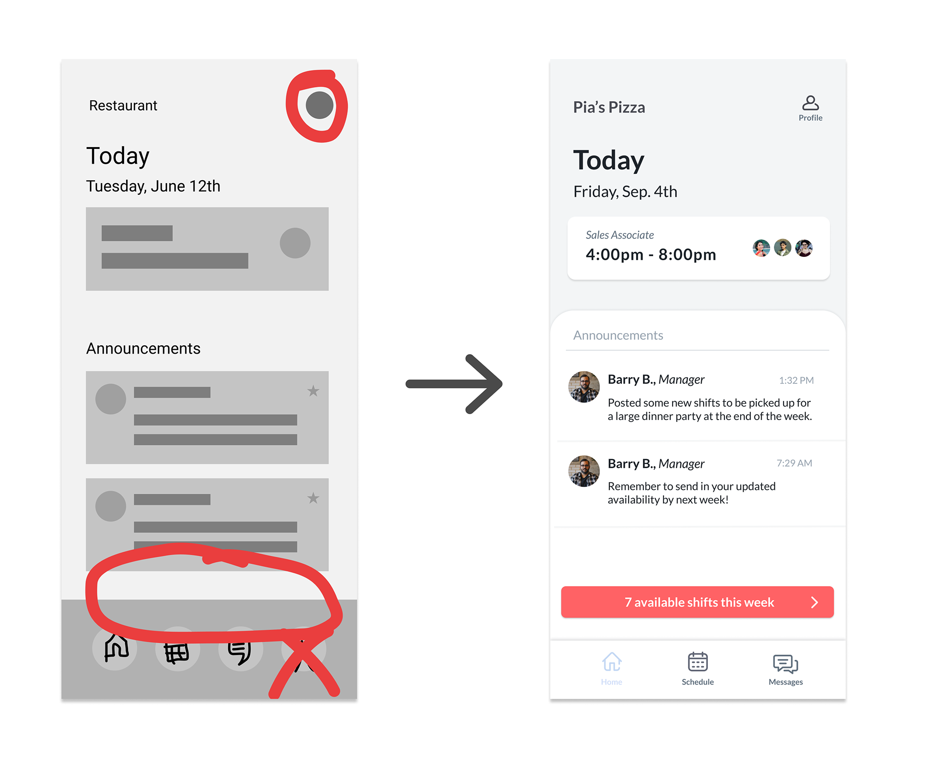
Three out of four participants were unsure where to find a cover for their shift, with one participant first navigating to the profile feature and one participant navigating to the messages feature. Two out of four participants did not notice the "Open Shifts" list at the top of the calendar screen.
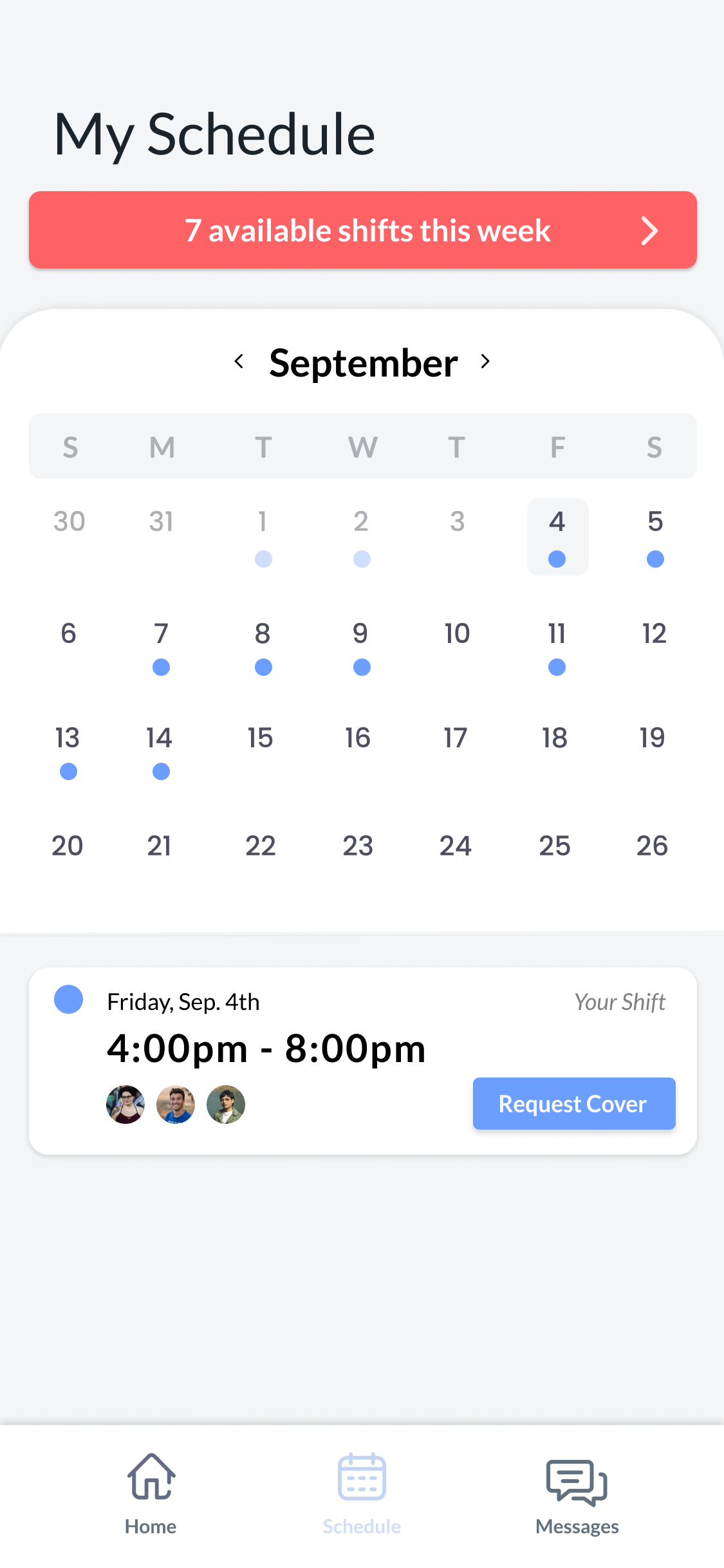
In order to fix this issue, the open shifts feature was replaced with a button to reduce cognitive overload and better highlight the calendar. The open shifts button was also put on the home page in order to create quick navigation for that action, and allow users to become familiar with the feature. I also used color to help differentiate and draw associations to where red elements are associated with "Open Shifts," and blue elements are associated with "My Shifts."
2. Users need better labels to navigate
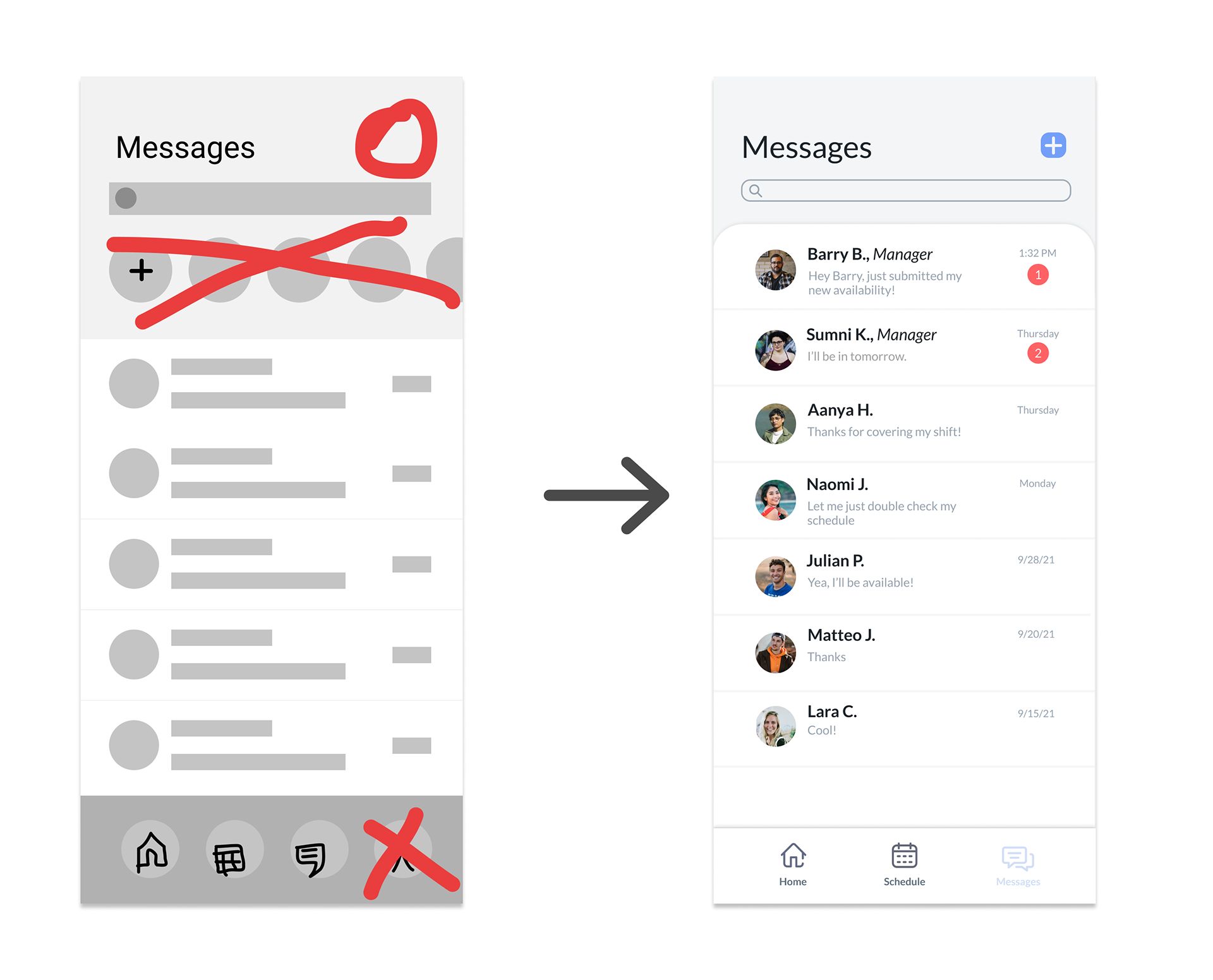
Two out of four participants were unaware the calendar was specific to their personal schedule. One participant thought the larger circles on the messages screen were employee stories rather than for messaging.
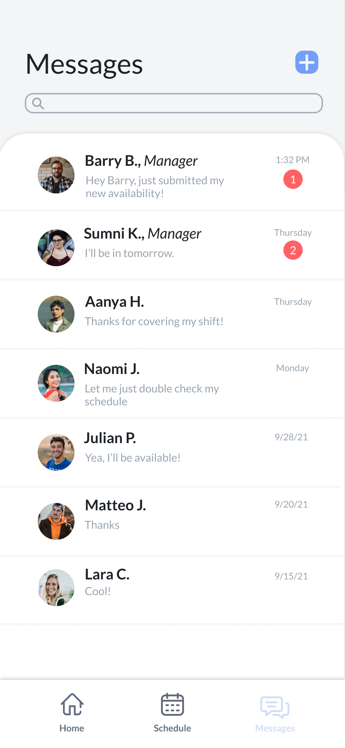
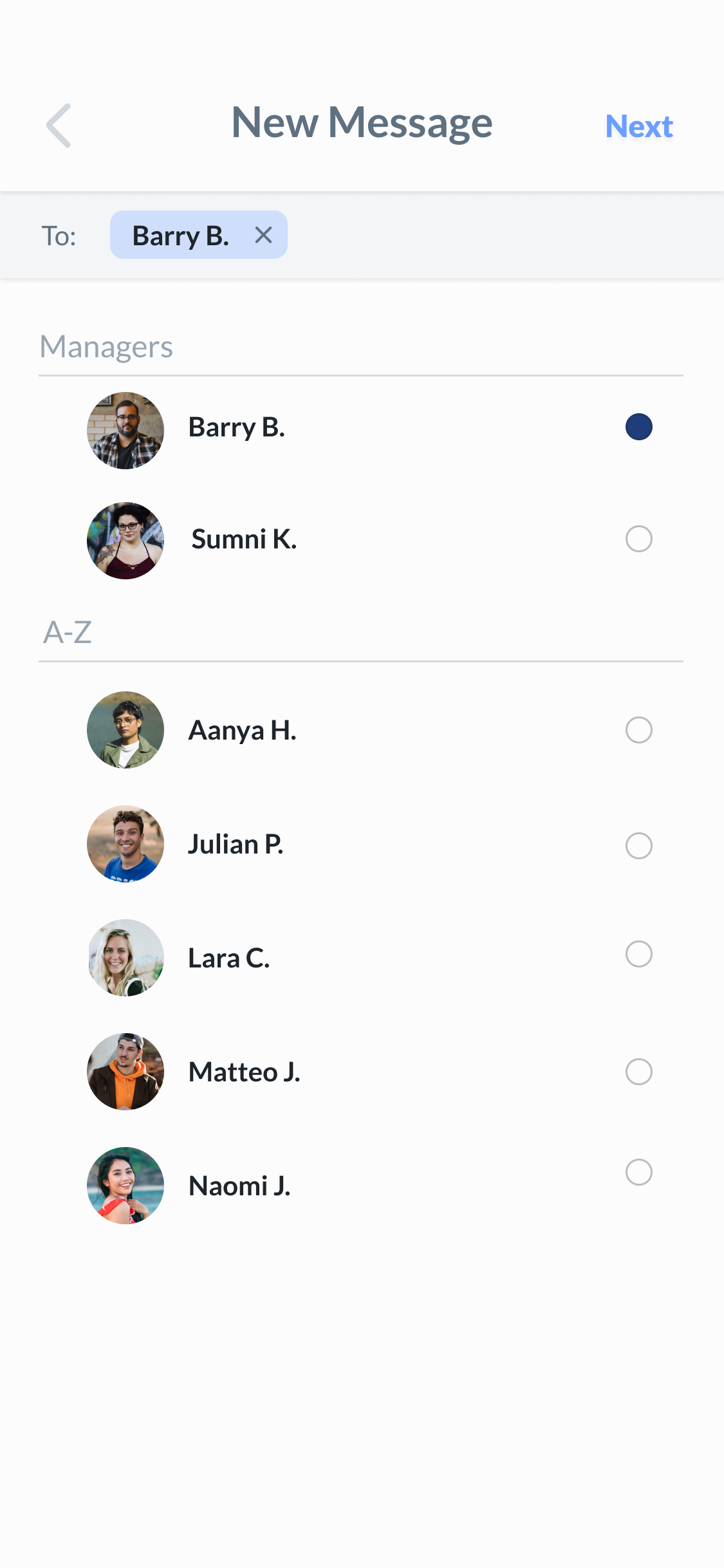
With this data, I rephrased "Schedule" to "My Schedule," and added labels to the navigation bar to limit reliability on icons alone. I also replaced the shortcut messages with a new message button in the top right corner that users would be more familiar with.
3. Users preferred content that was specific to scheduling only
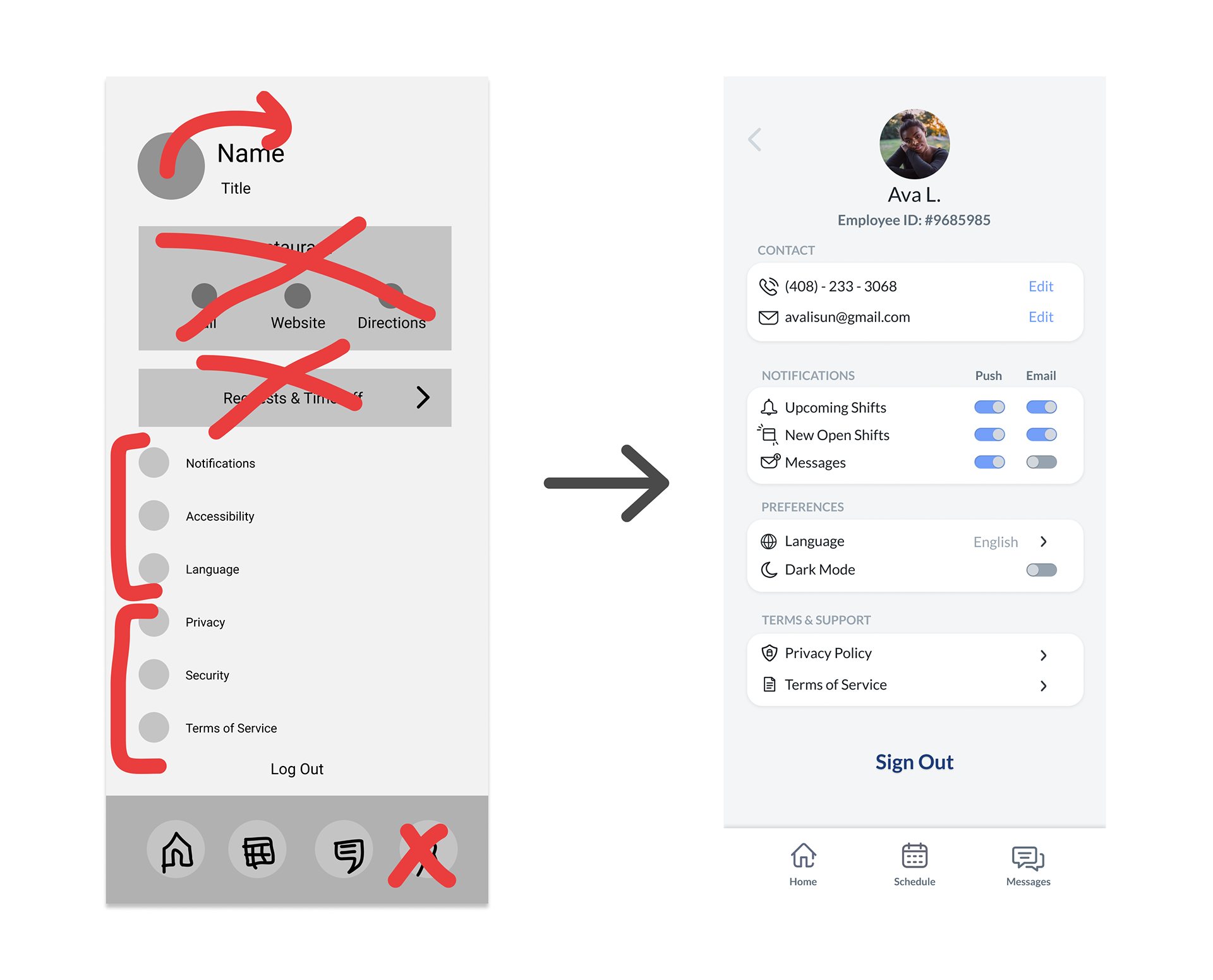
Three out of four participants stated that they would prefer to communicate their availability to their manager in person instead of through an app. All four participants did want to see employee-specific information, but none of them felt information about contacting the company was necessary.
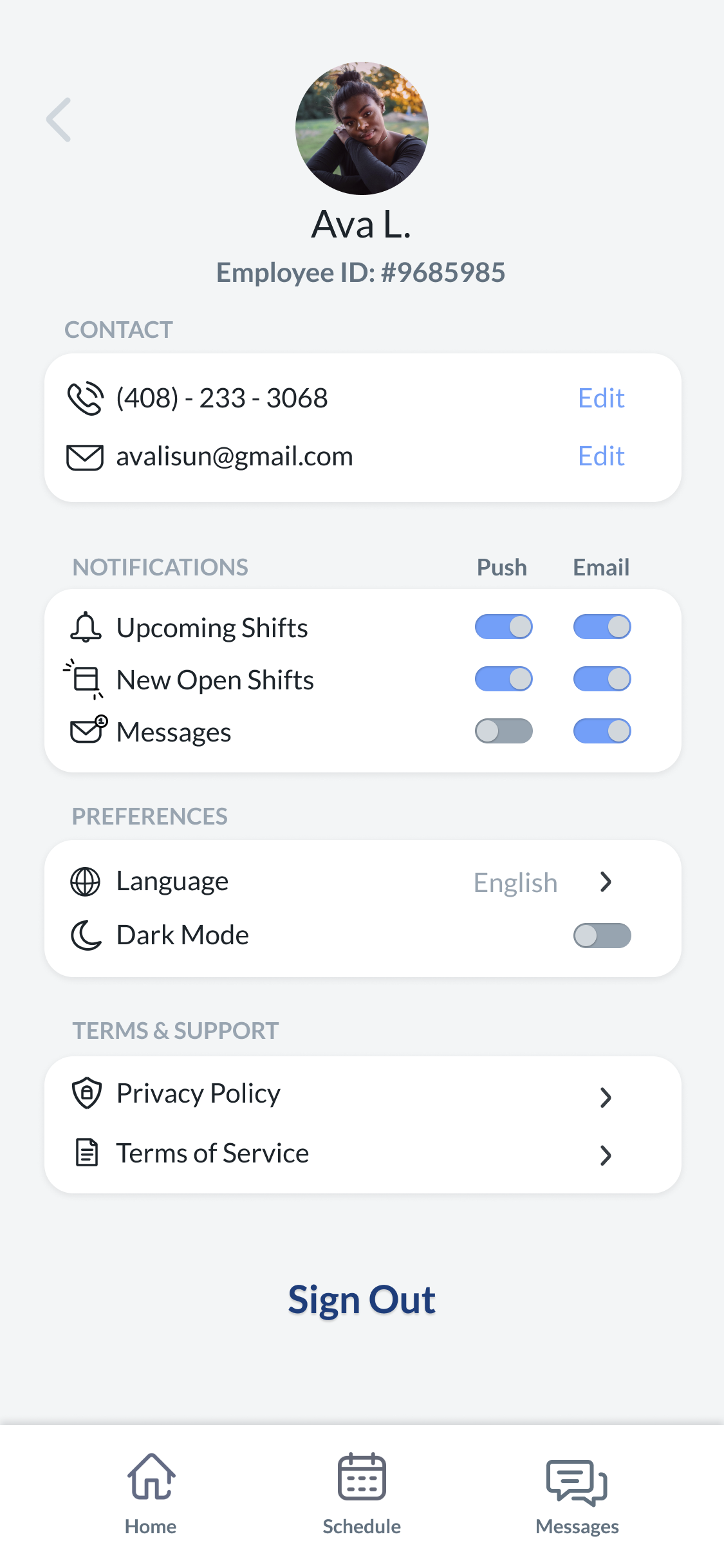
To adjust for these insights, I removed the company contact information in the profile section, and instead emphasized information specific to the employee, such as a phone number, email, and employee ID the company might have on record. Along with this, I removed the profile button in the navigation and placed it on the home page in order to create a more efficient user flow.

Style Guide
I chose to use the softer tones of two contrasting colors, red and blue, to emphasize the balance between work and life. Time-related imagery and wording were also used to hint at the idea that although industry jobs have reputations for fast-paced work environments, having control over your schedule can create a healthy efficiency.
Hi-Fi Wireframes & App Features
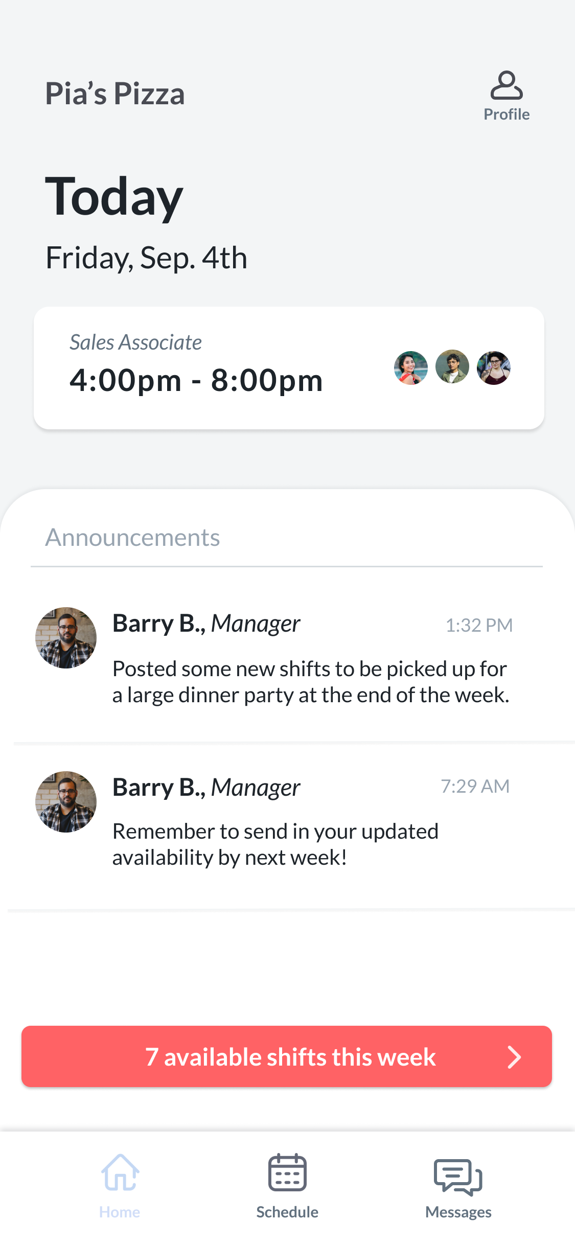
Pick-Up Shifts Easily
Users have the ability to view available shifts that have been posted by other coworkers throughout each week, giving a chance for employees to earn extra and choose shifts that fit their schedule better.

Request Covers & Update Your Info
Employees have the option to post their own shifts as well, which will notify other coworkers in search of a cover. With quick manager approval, the switch is simple and easy!
Direct Messaging
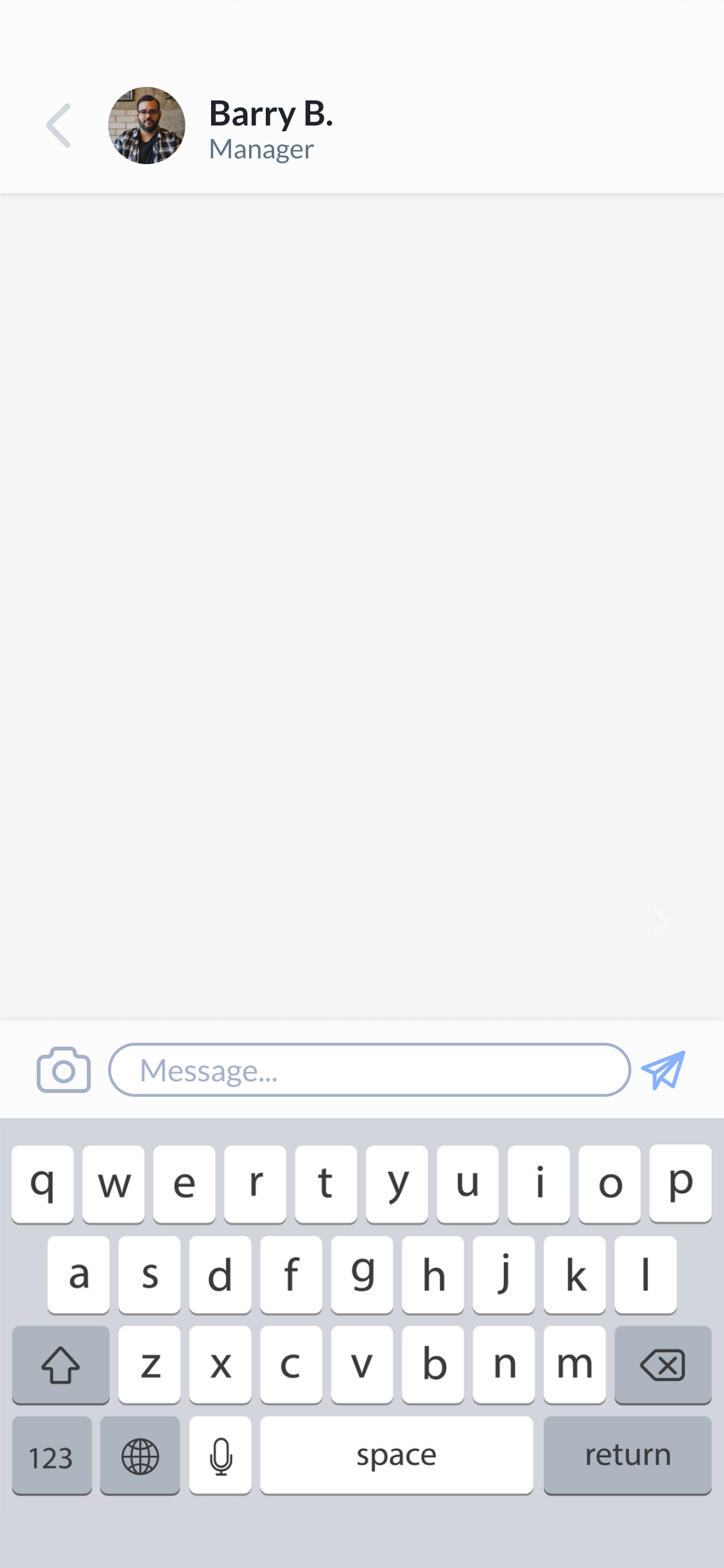
Users can easily communicate with coworkers without having to worry about privacy issues or taking the time to get their contact information.
Interactive Prototype
TAKEAWAYS
Pushing Buttons
While this project was technically solo, I had the teachings and direction from Google's UX Design Certificate program to guide me along! I learned so many completely new UX principles and was able to dive deep with this program. This project's prompt interested me because of my previous work experience in retail, but I had a broader goal to familiarize myself and experiment with newer UX material that I did not have as much experience with.
My main goals for this project were 1. to develop clearer user insights that would directly influence my designs, and 2. learn industry standards to certain UI elements. This course really helped me to learn and thoroughly plan my usability studies in order to create clear research questions, which would help responses form into themes, then into insights. With my goal to learn UI standards, Material Design became the biggest resource for me. I chose to dive extensively into buttons and color theory this round, but I hope to do more work with layout and hierarchy in my next project, to make the information as easy and accessible for the user as possible.
